Executive summary
In one week, we built an end-to-end medical imaging AI pipeline prototype that scores erosive hand osteoarthritis from hand X-rays: detecting each finger joint, evaluating it against the clinical GUSS scale, and producing GradCAM heatmaps that show where the model looked. One team, two modeling approaches, one strict evaluation protocol. The results: the best model reached a fivefold improvement over the baseline on the metric that matters clinically. Here's what we built, how we built it, and what it taught us about medical imaging AI.
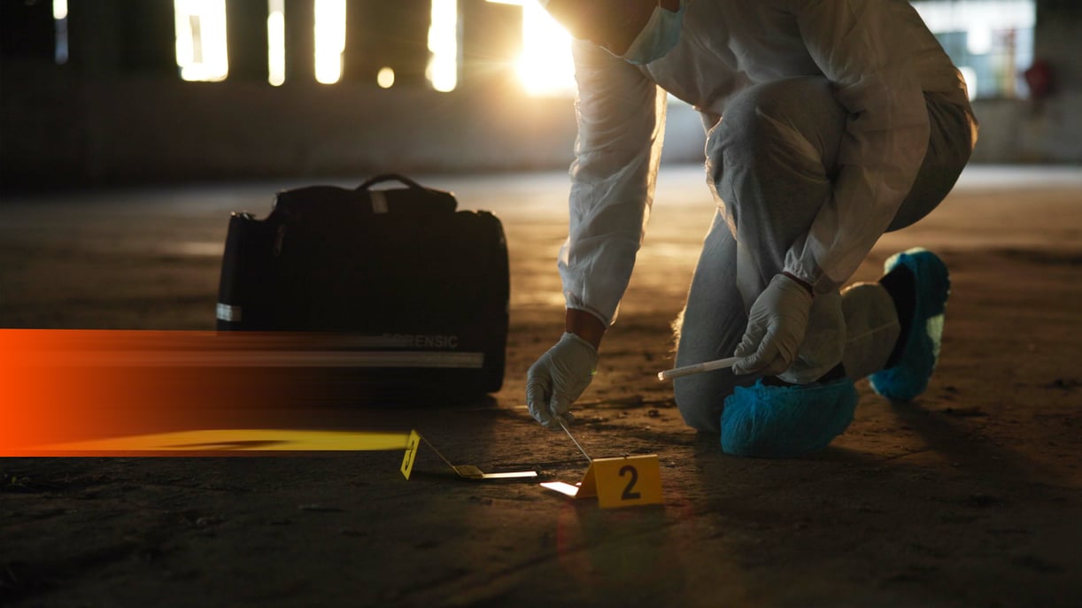
Teaching AI to see arthritis
Every year, in that strange quiet week between Christmas and New Year, something unusual happens at ML6. We close the door on client work, brew a lot of coffee, and spend a few days building things just because we want to. It's our annual Christmas projects week, equal parts hackathon, playground, and excuse to chase the ideas that never quite make it onto a roadmap.
This year, under our ML6 For Good program, we pointed that energy at projects with a clear positive impact. One of them sits squarely in a domain we care about a lot: medical imaging. The goal was to see how far a small team could push an automated scoring pipeline for erosive hand osteoarthritis, a painful, under-recognized disease, using only hand X-rays as input.
Erosive hand osteoarthritis, EHOA for short, affects up to 10% of women and 3% of men, and yet most people have never heard of it. It's an aggressive cousin of the more familiar osteoarthritis, mostly affecting postmenopausal women, that quietly eats away at the small joints of the fingers. It's painful, it's destructive, and right now there's no cure. Treatment is largely about managing the pain, with surgery as a last resort.

Erosive hand osteoarthritis, top to bottom. Top left and top middle: clinical appearance, with visible deformation of the affected finger joints. Top right: a corresponding hand radiograph showing the underlying bone damage. Bottom: 2 different PIP joints photographed at 6-month intervals, progressing through joint space narrowing, erosion, and eventual remodeling — the structural trajectory radiologists track over time. Image from Verbruggen et al., Annals of the Rheumatic Diseases (2010). Reproduced with permission.
To track the disease, radiologists rely on hand X-rays. They look for tiny telltale signs: joint space narrowing, bone eroding, structures slowly remodeling themselves. It's careful, skilled work; and it's also slow, and dependent on having an expert eye available. Two readers can disagree. The same reader can disagree with themselves a year later.

|
The joints that matter for tracking EHOA: distal interphalangeal (DIP) joints in blue, proximal interphalangeal (PIP) joints in green. Each hand has eight of them: four PIP, four DIP, and our pipeline evaluates each one independently. |
Machine learning is good at exactly this shape of problem. A model doesn't get tired, doesn't drift between Monday and Friday, and can score thousands of joints in the time it takes a human to score a handful. Done right, it could standardize assessments, accelerate clinical trials, and give researchers a sharper instrument for studying a disease that deserves a lot more attention than it gets.
The question is what "done right" actually means — and that's where the week went. Here's how we built it.
From guessing to GUSS-ing
If you want to teach a model to measure damage, you first have to answer a deceptively hard question: what does damage even look like, as a number?
Enter GUSS, the Ghent University Scoring System. GUSS is a radiographic scoring system built specifically for EHOA, and it gives us exactly what we need: a clear, quantitative way to describe what's happening inside a single joint.
Here's how it works. A radiologist looks at a standard hand X-ray and zooms in on three anatomical compartments of each finger joint:
- the subchondral bone
- the subchondral plate
- the synovial joint space
For each compartment, they estimate how much "normal," undamaged tissue is left, on a scale from 0 to 100, in steps of 10. Add the three compartments together and you get a single GUSS score for that joint, from 0 (complete destruction) to 300 (joint tissue fully intact or repaired).
Track that number over time and you can see the disease progressing, or occasionally, reversing. A falling score means erosion is winning. A rising score means the joint is remodeling itself. One number, one joint, one clear signal.
Worth being explicit: we're not trying to replicate the full clinical reading protocol here. GUSS is the target, not the goal. It gives us a well-defined, interpretable label to train against.
On the advice of Dr. Gust Verbruggen, the clinical rheumatologist who authored GUSS, we dropped the subchondral bone compartment. It correlates more weakly with overall outcomes than the other two. So in practice, our scores run from 0 to 200, built from the subchondral plate and the synovial joint space. Two compartments, still plenty of signal.
253 Patients, One Rule: Never Split a Patient
Our data came from two clinical studies, one contributing 444 joints from 154 patients, the other 3,837 joints from 99 patients, for a combined 4,281 joint images across 253 unique patients, collected at multiple trial timepoints.
The first decision was the easy one: split at the patient level, never at the joint level. This matters more than it might sound, because our data is longitudinal — most patients were scanned at multiple trial timepoints, so the same joint appears in the dataset multiple times, in slightly different states of the disease. Joints from the same patient also share anatomy and imaging conditions; let one slip into both the training and test sets and you've quietly poisoned your evaluation. So every joint belonging to a given patient, across every timepoint, lives in exactly one split — train (80%), validation (10%), or test (10%). No exceptions.
Why healthy data is a problem (when you're looking for disease)
Medical AI usually runs on hard mode. Annotations are expensive (only trained radiologists can label EHOA), and the cases you care about most, the diseased ones, are the rarest in the dataset. That's not a bug in the data collection. It's just biology: most joints, even in patients with EHOA, are healthy.
Our GUSS scores reflected that exactly: a long-tailed distribution with a dominant "healthy" peak at 200 (healthy in quotes, because a fully remodeled joint can also score 200. The score tells you the joint tissue is intact, not that the patient was spared).
A naïve random split would have made this worse. With so few diseased joints to go around, a bad shuffle could leave the validation or test set with almost no pathology. And an evaluation set without disease tells you nothing about how well your model detects disease.
So we stratified, but not on the raw GUSS score (too granular, too sparse at the tail). Instead, we labeled each patient as peak or non-peak based on their majority joint score, then stratified the patient-level split on that binary label. The result: every split holds a similar mix of severities, roughly 63–67% peak and 33–37% non-peak, and the validation and test sets keep enough diseased joints to actually measure what we care about.
Final tally:
- Train: 3,359 joints (202 patients)
- Validation: 462 joints (25 patients)
- Test: 460 joints (26 patients)

Train/val/test splits share the same underlying distribution as the full dataset.
A two-stage pipeline for a two-part question
EHOA happens at the level of a single finger joint. Our input is an entire hand.
So before writing a line of training code, we had to answer an architectural question: one model, or two?
The tempting path is one. Train a single end-to-end model that ingests a full-hand radiograph and directly emits per-joint scores. It's the kind of architecture that looks clean in a diagram — and rarely survives contact with real medical data.
We went with two: a dedicated detector that localizes every PIP and DIP joint in the hand, followed by a dedicated scorer that evaluates each cropped joint independently. Two reasons we preferred the split:
- Different problems, different inductive biases. Object detection needs spatial reasoning over a large, low-frequency field of view. Fine-grained joint scoring needs high-frequency texture analysis on a tightly cropped region. Forcing one architecture to do both tends to compromise it at both.
- Modularity as long-term leverage. State-of-the-art vision models move fast. A better detector or a stronger vision backbone will ship in six months, and probably again six months after that. With a modular pipeline, we swap one component, re-validate it in isolation, and ship — no full retrain or cascading regressions. Modularity is a gift you give your future self.
There's a third reason, softer but worth naming: separating detection and scoring makes the system easier to debug, easier to explain to a clinician, and easier to trust when the outputs eventually need to be defended.

The complete pipeline: a full-hand X-ray enters the joint detection model, which crops out all eight joints of clinical interest; each crop is then independently scored by the joint scoring model, producing a GUSS score per joint.
Joint Detection: Know Thy Joints
Bootstrapping the labels
Before we could train a detector, we needed labels — and nobody wants to hand-annotate thousands of bounding boxes if they don't have to. So we didn't.
We started with a small set of manually labeled hand X-rays, tagged with just two classes: PIP and DIP joints, corresponding to the lower and upper finger joints respectively. That was enough to train a first pass of YOLOv11s, a fast and widely-used object-detection model — not a final version, but a good enough one. We then turned its predictions loose on the rest of the dataset through Label Studio, an open-source annotation tool, where a human reviewer only had to correct bounding boxes rather than draw them from scratch.
It's a small workflow trick with an outsized payoff: a rough model accelerates its own labeling, and the dataset bootstraps itself. The time saved on annotation went straight back into the parts of the project that actually needed human attention.
From "a joint" to "which joint"
With a properly labeled dataset in hand, we retrained YOLOv11s from scratch, using the same patient-level train/validation/test split described above.
This time, the label scheme itself was the key change. Instead of the two classes we had used for bootstrapping (PIP, DIP), we gave every anatomical position its own label: PIP2 through PIP5, DIP2 through DIP5 — eight classes in total, one per joint of clinical interest. The GUSS annotations already encoded this positional information, so we had the labels effectively for free.
Two design consequences fell out of that choice:
- Positional disambiguation is baked into detection. The model doesn't just find joints; it knows which joint is which. We didn't build on that signal in this project (a one-week scope kept us focused on the baseline pipeline), but the positional information is sitting there in the detector's output, ready for position-aware scoring in a future iteration.
- Mislabels become structurally unlikely. With eight spatially ordered classes, a confident misclassification would require the model to violate hand anatomy. The task's own geometry acts as a regularizer. The final results below confirm that.
On a held-out test set of 52 full-hand radiographs, the detector reached mAP@0.5 of 0.995 and a normalized confusion matrix of exactly 1.0 along the diagonal — perfect classification across all eight classes.

Left: Normalized confusion matrix on the test set. Right: Precision-recall curve on the test set .
A brief caveat worth stating out loud: perfect test-set performance on 52 images is a strong signal, not a finished story. The detector's real job is to generalize to radiographs taken on different machines, in different clinics, with different patient populations. That's a validation question that lives beyond the scope of this project. For the scoring pipeline we're building here, it's more than good enough.
Cropping: a small step with an outsized effect
Once the detector locates each joint, we crop it out and hand it to the scorer. Two small choices determined the cropping method:
- Square crops, sized to the larger bounding box dimension. Computer vision models typically expect square inputs, and letting the larger axis dictate the crop size means we never lose anatomy to aspect-ratio distortion.
- A 10% margin around every box. Tight crops feel precise, but they punish you in three ways: they clip context that the scoring model might need, they leave no room for augmentation-time jitter, and they amplify any small localization error from the detector. A modest margin absorbs all three failure modes at almost no cost.
The output of this stage is a clean, consistent set of per-joint crops: each one square, centered, and expanded by a 10% margin drawn from the surrounding X-ray, though individual pixel dimensions vary with joint size. Ready to be handed to the scoring model.

One hand in, eight joints out. The detector localizes and labels each PIP and DIP joint of interest; each bounding box is cropped to a square with a 10% margin before being handed to the scoring model.
Joint Scoring: setting the rules
Two engineers split off to explore the problem from different angles — one supervised, one self-supervised — which turned what was supposed to be a sprint into a small bake-off.
Before either of them trained anything, we locked down a minimal but strict comparison protocol: same patient-level splits defined earlier, same cropped inputs, and same target (a GUSS score in increments of 10). No tuning against the frozen test set. Preprocessing (normalization, augmentation, etc.) was allowed and encouraged, but it had to be documented, not smuggled in. Any training approach was fair game: continuous regression, ordinal classification, binned prediction, as long as the model ultimately emitted a single scalar per joint at evaluation time. And finally, the same two metrics computed the same way.
The last point — choice of metric — is where many medical-imaging projects quietly go wrong.
Choosing metrics that respect the problem
The obvious metric is Mean Absolute Error (MAE): the average, in GUSS points, of how far off our predictions are. It's interpretable, it's standard, and it maps cleanly onto the clinical scale.
But MAE alone is a trap on a long-tailed dataset. Roughly two-thirds of our joints sit at the “healthy” peak (GUSS = 200). A model that does nothing but predict "200" for every joint will score a suspiciously respectable MAE, simply because it's right on the easy majority and wrong only on the minority that actually matters. So we report MAE twice:
- MAE (all joints): the headline number.
- MAE (non-peak joints only): the honest one. This is where disease detection actually lives.
Then a second metric, borrowed from how clinicians already reason about this scoring system: Within-20.
A prediction counts as Within-20 if it lands within ±20 GUSS points of the reference score. The ±20 tolerance isn't arbitrary. It comes from the published smallest detectable change (SDC) of GUSS itself. After structured reader training, expert radiologists cannot reliably distinguish differences smaller than ~18–20 points from measurement noise. In other words, two trained humans scoring the same joint will routinely disagree by up to 20 points.
That's a useful anchor. A model whose prediction lands within ±20 of the reference is, in a meaningful sense, clinically indistinguishable from a second expert reader. Below that threshold, we're chasing noise. Above it, we have a real error.
We report Within-20 the same two ways as MAE: over all joints, and over non-peak joints only.
A quick honesty note: SDC is formally defined for longitudinal change (same joint, same reader, different timepoints), not for cross-sectional prediction. We're borrowing it as a reasonable proxy for acceptable error magnitude, not claiming formal equivalence.
Baselines that force honesty
Every approach had to beat two baselines. Trivial by design.
- Baseline A: The "always healthy" predictor. Predict the peak score (GUSS = 200) for every joint, regardless of input. Exploits the class imbalance directly. Any model that can't meaningfully outperform this on the non-peak metrics isn't doing disease detection — it's doing demographics.
- Baseline B: Train-set central tendency. Predict the mean (or median) GUSS score of the training set. A slightly different kind of lazy: the model that doesn't look at the image at all, just at the prior.
Both baselines are weak. That's exactly why they matter. A scoring model that can't clearly beat "always predict 200" on the non-peak slice is telling you something — usually that the class imbalance has silently eaten the signal. Cheap baselines catch expensive mistakes.
With the rules of the game written down, there was one more shared foundation to lay before letting the two approaches diverge: how to train against a distribution that was actively trying to deceive us.
Training against the long tail
With the evaluation protocol locked down, both engineers faced the same underlying challenge from the earlier data section: a training set where roughly two-thirds of the joints sit at the “healthy” peak, and the interesting minority is scattered across a long tail. Interestingly, both converged on the same two-pronged response: augmentation to squeeze more signal out of every example, and weighted sampling to rebalance what the model actually sees during training.
Augmentation, with a radiologist in mind. Augmentation is standard practice, but on medical images it's easy to get wrong. Too aggressive and you create transformations that don't exist in the real clinical distribution — or worse, that destroy the very features the model is supposed to learn from. So every transformation had to earn its place by answering a single question: does this correspond to a variation a real hand X-ray might plausibly have?
Four transformations survived that filter:
|
Transform |
Parameters |
Why it's clinically defensible |
|
Horizontal flip |
50% probability |
Left and right hands are near-mirror images at the joint level; the model shouldn't care which side it's looking at. |
|
Rotation |
±15°, 70% probability |
Hand positioning on the X-ray table is never perfectly aligned. Small rotations reflect real acquisition variance. |
|
Affine scaling |
±10% |
Accounts for minor differences in source-to-detector distance and patient anatomy. |
|
CLAHE |
Always applied |
Contrast-Limited Adaptive Histogram Equalization. Standardizes the visibility of bone structures across the dataset, partially absorbing differences between imaging devices and acquisition settings |

Original joint crop on the left, followed by three augmented versions.
Rebalancing without inflating. Augmentation makes each training example more useful. It doesn't, on its own, fix the fact that the model sees a healthy joint twice as often as a diseased one. Left alone with that distribution, a scoring model quickly discovers an uncomfortable shortcut: predict 200, be right most of the time, collect your MAE.
Our baseline A was designed to catch exactly that failure. The training strategy was designed to prevent it.
We used inverse frequency weighted sampling: each GUSS score bin gets a sampling weight proportional to the inverse of its frequency in the training set. Rare severities get drawn often; the healthy majority gets drawn less often. Over an epoch, the model sees a balanced distribution of severities, even though the underlying dataset is anything but.
Two details that matter here:
1. Sampling with replacement. Rare examples get drawn repeatedly across an epoch. On its own, that's a recipe for overfitting: the model memorizes the few dozen severe cases instead of learning to generalize from them.
2. Fresh augmentation per draw. Because augmentation is applied on the fly each time a sample is drawn, a rare example that gets seen five times in an epoch is seen five slightly different ways. Each view is plausibly different at the pixel level but anatomically identical. The combination of weighted sampling and stochastic augmentation effectively synthesizes variation in exactly the classes that need it most.
The net effect: the model gets balanced exposure across the severity spectrum, letting the small amount of real disease in our dataset do more work.
Two approaches, one bake-off
With the evaluation protocol in place and the sampling strategy agreed on, the two engineers went their separate ways — one leaning into self-supervised representations, the other into supervised transfer learning. Both ended up converging on a similar architectural pattern (a two-stage pipeline), but for different reasons and with different strengths.
Approach 1: DINOv3 embeddings and a two-stage head
The first approach started from a question worth asking on any medical-imaging project: how much of this problem can we solve without labels?
DINOv3 is Meta's self-supervised vision model, trained on a staggering amount of unlabeled imagery to produce general-purpose visual embeddings. We used the ViT-Base checkpoint from Hugging Face and fed it our cropped joints, with the goal of reusing its representations rather than fine-tuning the backbone.
1/ A first experiment: similarity search with no model at all
Before training anything, we ran a pure retrieval baseline. For each test joint, we embedded it with DINOv3, found the five nearest training-set joints by cosine similarity, and averaged their GUSS scores. No head, no training, no loss function — just embeddings and a lookup.
The result was revealing: this "model-free" approach beat both of our trivial baselines on MAE, and edged slightly ahead on Within-20 for non-peak joints, but lost ground on the full dataset. The diagnosis was informative. DINOv3's embeddings captured joint shape well, but missed the fine-grained cues that actually carry the GUSS score: changes in the synovial space, subtle erosion of the subchondral plate. The embedding sees the joint as a whole; the disease hides in a sliver of it. A dedicated scoring head was necessary.

Similarity Search: good prediction example.

Similarity Search: bad prediction example
2/ Adding a head, then adding a second one
We froze the DINOv3 backbone and tried several head designs on top. A 10-way classifier over score buckets underperformed: binning discards the ordinal structure of GUSS, and with so few examples per non-peak bin, the model never built a stable decision surface. Ordinal regression did better: it treats scores as ordered categories rather than independent classes, so predicting 80 when the truth is 100 is penalized less than predicting 10. On a metric like Within-20, that distinction matters. It was a move in the right direction, but the model still struggled with the imbalance.
The configuration that worked best mirrored the overall pipeline's own philosophy: split the problem.
- Stage 1: a binary classifier on frozen DINOv3 features, predicting peak vs non-peak with a standard binary cross-entropy (BCE) loss and inverse-frequency class weighting.
- Stage 2: a continuous regressor, also on frozen DINOv3 features, trained only on non-peak joints with a Huber loss (a regression loss robust to outliers, with its threshold δ=20 deliberately aligned with our Within-20 tolerance).
At inference: if Stage 1 flags the joint as peak, we return 200. Otherwise, Stage 2's regression output is clamped to [0, 199] and returned.
Approach 2: EfficientNet-B3, supervised, end-to-end fine-tuned
The second approach took the opposite bet: rather than lean on a general-purpose embedding, fine-tune a strong supervised backbone directly on our data.
EfficientNet-B3 is a convolutional architecture that hits a sweet spot of accuracy and parameter efficiency for medical imaging at our dataset size. It arrives pretrained on ImageNet (not medical imagery, but close enough that low-level features such as edges, textures, contrast patterns transfer usefully), and we fine-tuned it end-to-end on the cropped joints.
Architecturally, this approach landed on the same two-stage split as the DINOv3 one, independently, which is itself a signal that the problem structure is doing the pushing. Same logic, different mechanics:
- Stage 1: a binary classifier (peak vs non-peak) with a sigmoid output and a 50% decision threshold.
- Stage 2: an ordinal regression head using CORAL (Consistent Rank Logits). Mechanically, CORAL outputs 20 cumulative probabilities: P(score ≥ 10), P(score ≥ 20), … P(score ≥ 190). The final score is the sum of these probabilities × 10.

A diseased joint scored by the two-stage pipeline. Stage 1 (binary classifier) flags the joint as diseased. Stage 2 (CORAL ordinal regression) outputs a cumulative probability for each score threshold: each bar above the 0.5 line adds 10 points. Final score: 150.
The contrast worth drawing
Both approaches converged on a two-stage architecture, but they got there from opposite directions.
The DINOv3 approach treats the backbone as a fixed, general-purpose feature extractor and does all the learning in lightweight heads on top. It's data-efficient, fast to train, and philosophically aligned with the direction much of vision research is heading: one big pretrained model, many small task-specific heads.
The EfficientNet approach treats the backbone as task-specific infrastructure, fine-tuned end-to-end on our data. It's more compute-hungry, more prone to overfitting on a dataset of this size, but it gets to shape its entire feature hierarchy around the GUSS problem.
Neither is obviously right. On a longer-horizon project, the comparison is genuinely interesting, and the evaluation protocol we locked down earlier was exactly what made it possible to run this comparison without anyone gaming the outcome.
Looking inside the model: GradCAM
A scoring model that produces a number is useful. A scoring model that tells you why it produced that number is trustworthy.
For the EfficientNet pipeline, we added GradCAM on top of both stages, generating heatmaps that highlight which regions of the joint image most strongly influenced the prediction. The Stage 1 heatmap shows where the model looked to decide peak vs non-peak; the Stage 2 heatmap shows where it looked to assign a severity score.
For a radiologist reviewing the system's output, this is the difference between a black box and a colleague. A model that attends to the synovial space and subchondral plate when flagging disease is doing something anatomically sensible. A model that attends to the margins of the crop, or the bone shaft, is telling you something's wrong — possibly with the model, possibly with the crop, possibly with the data. In both cases, you learn something you couldn't learn from the score alone.
Interpretability, for medical AI, is not a nice-to-have. It's how the system earns the right to be used.

GradCAM on the stage 1 head

GradCAM on the stage 2 head
What the numbers say
With the protocol frozen and the approaches trained, we could finally line up the results on a single table:
|
Model |
MAE (all) ↓ |
MAE (non-peak) ↓ |
Within-20 (all) ↑ |
Within-20 (non-peak) ↑ |
|
Baseline A: predict peak (200) |
26.24 |
73.60 |
68.48% |
11.59% |
|
Baseline B: predict median (200) |
26.24 |
73.60 |
68.48% |
11.59% |
|
Baseline B: predict mean (171.9) |
35.20 |
47.97 |
8.48% |
23.78% |
|
DINOv3 + similarity search |
22.61 |
40.73 |
59.8% |
27.4% |
|
DINOv3 + two-stage |
17.07 |
37.93 |
74.3% |
41.5% |
|
EfficientNet-B3 + two-stage |
13.5 |
30.24 |
79.6% |
56.71% |
A few things jump out immediately.
The baselines confirm the shape of the data. Baseline A (always predict 200) and Baseline B with the median (also 200) produce identical numbers across all four metrics. That's not a coincidence — it's the distribution telling us how heavily it leans on the peak. More than half our test set has a GUSS score of 200, so the median collapses to the mode.
The "headline" metric lies. Baseline A achieves a respectable-looking 68.5% Within-20 overall. On a slide, that number looks like something. On closer inspection, it's a statistical illusion: the baseline is right only because 64% of test joints are peak joints, and "predict 200" is automatically within tolerance for those. On the non-peak joints, the ones that actually matter clinically, Baseline A is within tolerance 11.6% of the time. Roughly one joint in nine. Essentially useless where use is needed.
This is exactly why we split every metric into "all joints" and "non-peak joints." The right-hand column is the one that tells you whether the model has learned anything about disease.
The ranking tells a coherent story. Moving from similarity search → DINOv3 with a trained two-stage head → EfficientNet with the same two-stage architecture, every metric improves monotonically, and the gap on non-peak joints widens faster than the gap on the full test set. In plain terms: the more the model is allowed to specialize on the problem, the better it gets at the thing we actually care about.
Our best result — EfficientNet-B3 with the two-stage pipeline and weighted sampling, reaches 56.7% Within-20 on non-peak joints, compared to the 11.6% of the peak-predicting baseline. That's a factor-of-five improvement on the metric that has clinical meaning, on a dataset that was actively working against us.
Is it a deployable model? No. We're a week in, on a single-center dataset, without external validation. But it's a credible signal that the pipeline is learning something real about the disease, and that the evaluation protocol, sampling strategy, and architecture choices from the previous sections are all pulling in the same direction.
Bringing the pipeline to life
Models in a notebook don't convince anyone. So one engineer spent the last stretch of the week wrapping the pipeline into something you could actually click.
We wrapped it in a thin FastAPI backend: a single /analyze endpoint that runs the full pipeline (detection → cropping → scoring) with an optional include_heatmaps flag for GradCAM, which adds about 20 seconds per call. That's the honest cost of interpretability on this stack. The frontend, built with Lovable, walks a user through the pipeline visually: the original X-ray, the detected joints, the crops, the scores, the heatmaps.
Neither piece is architecturally deep. That's the point. A week-long project doesn't need production infrastructure — it needs the shortest honest path from model to something you can show a clinician, a client, or a teammate who doesn't read PyTorch. Lovable and FastAPI, together, get you there in an afternoon.
.gif?width=800&height=450&name=demo_blogpost%20(1).gif)
End-to-end: detection, scoring, and interpretability on a real hand X-ray. Video sped up; GradCAM generation adds ~20 seconds per call.
Wrapping up
Going in, the question was simple: could a week be enough to automate a scoring protocol as nuanced as GUSS?
Going out, the answer is a careful yes — with the emphasis on careful. We didn't set out to build a clinical-grade system, and we didn't build one. What we did build is a pipeline that learns something real about the disease, evaluated honestly, on metrics grounded in how radiologists actually work. The best model reaches 56.7% Within-20 on pathological joints: a fivefold improvement over the peak-predicting baseline, on a dataset that was actively working against us.
More than the numbers, though, the week was a reminder of something that's easy to forget between client deliverables: the problem teaches you if you let it. The two-stage architecture wasn't chosen from a diagram; it emerged, independently, from two engineers running into the same failure modes. The Within-20 metric wasn't pulled from a tutorial; it came from reading the GUSS literature until we understood what "close enough" means to a radiologist. The sampling strategy wasn't a default; it was designed to defeat the specific shortcut our baselines were built to catch.
What we built this week is a pipeline. The client version is the same shape with everything we deliberately deferred, put back in: rigorous validation, regulatory framing, deployment, monitoring. The regulatory framing, in particular, has become heavier — the EU AI Act now classifies most medical-imaging AI as high-risk, which shapes both the validation regime and the deployment timeline. That’s the work we usually do, compressed here into the parts that fit between Christmas and New Year.
What we'd do next
A week is a week. A few directions stood out as worth pursuing if we ever pick this up again:
- Position-aware scoring. Our scorer treats each joint independently; on the radiologist's advice, the clinical protocol itself is joint-agnostic. But the detector already labels each joint by its anatomical identity, and that signal is sitting there unused. Conditioning the scoring model on joint position could close some of the gap on non-peak metrics at almost no cost.
- Medical foundation models. Our DINOv3 experiments were a proof of concept for “general-purpose embeddings + a small head.” A model pre-trained specifically on medical imagery, MedGemma for instance, or a domain-adapted variant of DINOv3 itself, like MedDINOv3, could give us representations that already understand what “bone” and “joint space” look like, before we ever train a head.
- External validation. The obvious one, and the one a week doesn't buy you. Any serious claim about generalization requires imaging from different scanners, centers, and patient populations than the one we trained on.
A Thank You
A week this productive only happens when someone on the other side of the project is genuinely invested. We're especially grateful to Dr. Gust Verbruggen, for making the data available, for answering our questions about clinical nuance as they came up, and for steering us away from the subchondral bone compartment early enough that we didn't waste half the week on a dead end. This project exists because he made it possible.
Built by
Massive thanks to the entire team for contributing to the project.
- Zakaria Oubbi
- Hakim Amri
- Medha Hegde
- Axel Nordfeldt
References
-
Favero M, Belluzzi E, Ortolan A, et al. Erosive hand osteoarthritis: latest findings and outlook. Nature Reviews Rheumatology. 2022;18(3):171–183. https://doi.org/10.1038/s41584-021-00747-3
-
Verbruggen G, Wittoek R, Vander Cruyssen B, Elewaut D. Morbid anatomy of erosive osteoarthritis of the interphalangeal finger joints: an optimised scoring system to monitor disease progression in affected joints. Annals of the Rheumatic Diseases. 2010;69(5):862–867.https://doi.org/10.1136/ard.2009.112714
-
Verbruggen G, Wittoek R, Vander Cruyssen B, Elewaut D. Tumour necrosis factor blockade for the treatment of erosive osteoarthritis of the interphalangeal finger joints: a double blind, randomised trial on structure modification. Annals of the Rheumatic Diseases. 2012;71(6):891–898. https://doi.org/10.1136/ard.2011.149849
-
Haugen IK, Englund M, Aliabadi P, Niu J, Clancy M, Kvien TK, et al. Prevalence, incidence and progression of hand osteoarthritis in the general population: the Framingham Osteoarthritis Study. Annals of the Rheumatic Diseases. 2011;70(9):1581–1586. https://doi.org/10.1136/ard.2011.150078
-
Cao W, Mirjalili V, Raschka S. Rank consistent ordinal regression for neural networks with application to age estimation. Pattern Recognition Letters. 2020;140:325–331. https://doi.org/10.1016/j.patrec.2020.11.008
-
Selvaraju RR, Cogswell M, Das A, Vedantam R, Parikh D, Batra D. Grad-CAM: visual explanations from deep networks via gradient-based localization. Proceedings of the IEEE International Conference on Computer Vision (ICCV). 2017:618–626. https://doi.org/10.1109/ICCV.2017.74
-
Siméoni O, Vo HV, Seitzer M, Baldassarre F, Oquab M, Jose C, Khalidov V, Szafraniec M, Yi S, Ramamonjisoa M, et al. DINOv3. arXiv preprint arXiv:2508.10104. 2025. https://arxiv.org/abs/2508.10104
-
Tan M, Le QV. EfficientNet: rethinking model scaling for convolutional neural networks. Proceedings of the 36th International Conference on Machine Learning (ICML). 2019:6105–6114. https://arxiv.org/abs/1905.11946